
TL;DR:
- Most small business websites neglect ongoing mobile optimization, risking lost traffic and revenue. Improving Core Web Vitals and adopting responsive design are critical for SEO and user experience in South Africa’s mobile-centric market. Regular audits and expert support help sustain high performance, enhancing visibility and customer engagement.
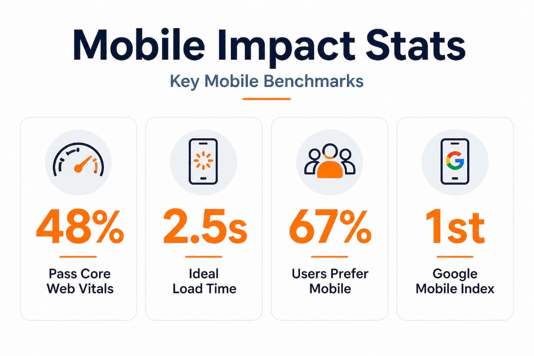
Most small business owners put serious effort into getting their desktop website looking sharp, and then assume the job is done. It is not. Only 48% of mobile sites pass all three Core Web Vitals benchmarks, meaning more than half of websites are quietly failing customers every single day. In South Africa, where mobile internet access is the dominant way people browse, shop, and find local services, a poor mobile experience is not a minor inconvenience. It is a direct threat to your visibility, your revenue, and your reputation. This article breaks down why mobile optimization matters and exactly what you should do about it.
Table of Contents
- Why mobile optimization is critical today
- How mobile optimization impacts SEO and engagement
- Responsive design vs other mobile solutions
- Practical steps to improve your site’s mobile performance
- What most guides miss about mobile optimization
- Boost your business with expert mobile optimization support
- Frequently asked questions
Key Takeaways
| Point | Details |
|---|---|
| Mobile-first indexing | Google uses your mobile site to decide search rankings, not your desktop version. |
| Core performance benchmarks | Meeting Core Web Vitals is vital for both SEO and keeping visitors engaged. |
| Responsive design advantage | Responsive design is the simplest, most effective strategy for most small businesses. |
| Ongoing maintenance required | Mobile optimization is not a one-time task—regular audits keep your site competitive. |
| Quick wins matter | Small, consistent improvements to performance and UX can lead to real business growth. |
Why mobile optimization is critical today
South Africa has one of the highest mobile internet usage rates on the continent. Most South Africans access the web through smartphones, often on mid-range Android devices using mobile data rather than home broadband. This shapes how people interact with websites, how patient they are with slow load times, and what kind of experience they expect when they land on your page. If your site is clunky, hard to read, or takes more than a few seconds to load on a mobile screen, visitors leave. They do not come back.
The stakes are even higher now because Google’s mobile-first indexing means Google primarily uses the mobile version of your website for crawling, indexing, and determining your search rankings. That is not a rumour or a future plan. It is the current reality. If your mobile site is weak, your Google rankings suffer, regardless of how polished your desktop version looks.
“Google primarily uses the mobile version of a site’s content for indexing and ranking. Mobile-first indexing is now the default for all websites.” — Google Search Central
Here is what poor mobile optimization actually costs your business:
- Higher bounce rates: Visitors who land on a slow or broken mobile page leave almost immediately, sending negative signals to search engines.
- Fewer conversions: If a customer cannot easily click your contact button or fill in a form on their phone, they will go to your competitor instead.
- Lower SEO rankings: Google penalises poor mobile experiences through its page indexing strategies and scoring systems, pushing your site further down search results.
- Poor brand perception: A clunky mobile site tells potential customers that you are not keeping up, which erodes trust before a conversation even starts.
- Missed local discovery: Most “near me” searches happen on mobile. If your site is not mobile-friendly, you are invisible to those high-intent searchers.
Reading up on mobile SEO tips for local businesses can help you understand the specific adjustments that make a measurable difference in South African markets.
How mobile optimization impacts SEO and engagement
Understanding that mobile matters is one thing. Understanding how it affects your SEO in measurable, technical ways is where most small business owners gain a real edge. Google evaluates your site’s mobile performance using a set of metrics called Core Web Vitals. These are three specific measurements of real user experience.
| Metric | What it measures | Good score | Needs improvement | Poor score |
|---|---|---|---|---|
| LCP (Largest Contentful Paint) | How fast your main content loads | ≤ 2.5 seconds | 2.5–4.0 seconds | > 4.0 seconds |
| INP (Interaction to Next Paint) | How quickly your page responds to user input | ≤ 200ms | 200–500ms | > 500ms |
| CLS (Cumulative Layout Shift) | How stable your page layout is while loading | ≤ 0.1 | 0.1–0.25 | > 0.25 |
These numbers might look abstract, but they have real-world consequences. Only 48% of mobile sites pass all three benchmarks, which means your competitors are likely struggling here too. That is actually an opportunity. If you improve your scores while they do not, you gain a meaningful ranking advantage.

Reading a full breakdown of Core Web Vitals explained can help you understand what drives each score and why it connects directly to customer behaviour on your site.
Here is the step-by-step chain reaction that happens when a mobile site performs poorly:
- Slow load time: Your page takes more than 3 seconds to display content on a mobile device.
- Visitor abandons the page: Studies consistently show bounce rates spike sharply after the 3-second mark.
- Engagement signals drop: Google tracks these signals. High bounce rates and short visit durations signal poor quality.
- Rankings fall: Google moves your page lower in search results, reducing your visibility to new customers.
- Fewer visitors arrive: Lower rankings mean fewer people even find your site to begin with.
- Conversion rate drops: The reduced traffic that does arrive is often less qualified or less ready to act.
- Revenue declines: Fewer leads, fewer calls, fewer sales. The impact lands squarely in your bottom line.
Understanding this chain is important because it shows that mobile performance is not just a technical issue. It is a business issue that flows directly into website speed and sales outcomes.
Pro Tip: Run your site through Google PageSpeed Insights (it is free) once a month. Focus on the mobile tab first. Fix the top three flagged issues before worrying about desktop scores, since Google’s indexing decisions are based primarily on the mobile experience.
Responsive design vs other mobile solutions
Not all mobile solutions are equal, and choosing the right approach for your business has long-term consequences for your SEO, your maintenance workload, and your customer experience. There are three main approaches: responsive design, separate mobile sites, and Accelerated Mobile Pages (AMP).
| Approach | How it works | Pros | Cons |
|---|---|---|---|
| Responsive design | One site that automatically adjusts layout to any screen size | Single URL, consistent SEO, easy maintenance | Requires thoughtful design upfront |
| Separate mobile site (m. site) | A different website served to mobile users | Highly customised for mobile | Two sites to maintain, duplicate content risks, complex SEO |
| AMP (Accelerated Mobile Pages) | Stripped-down HTML pages designed for instant loading | Very fast for static content | Limited functionality, restricted design, less relevant in 2026 |
Responsive design is preferred over separate mobile sites or AMP for the vast majority of small businesses. The reasons are practical and significant.
Benefits of responsive design that matter most to South African SMEs:
- One site to maintain: You update content once, and it works correctly across all devices. No risk of your mobile site showing outdated information.
- Consistent URLs: Search engines do not have to split ranking signals between two versions of your site, so your SEO authority stays concentrated.
- No redirect issues: Separate mobile sites often cause slow redirects when mobile users land on a desktop URL. Responsive design eliminates this.
- Better user experience: Customers on any device get the same information, functionality, and contact options without being sent somewhere else.
- Lower long-term cost: One codebase is cheaper to build and maintain than two, which matters greatly for resource-limited small businesses.
AMP still makes practical sense in very specific situations. If you run a news or blog-heavy site where articles are mostly static text, AMP can still deliver a speed advantage. But for a typical small business site with contact forms, product listings, booking systems, or dynamic content, AMP is too restrictive to be worth the trade-offs in 2026.
Pro Tip: If you are building or redesigning your site, commit to responsive design from day one. Retrofitting a desktop-only site for mobile is always more expensive and disruptive than getting it right during the initial build. If you are unsure, exploring mobile SEO in South Africa will show you exactly what well-optimized local sites look like in practice.
Practical steps to improve your site’s mobile performance
Knowing what to fix is useful. Knowing the order in which to fix it is what saves you time, money, and frustration. Most small business owners do not have a dedicated developer on call. These steps are designed to be prioritized based on impact and accessibility.
Essential mobile optimization quick wins:
- Switch to a responsive theme or framework: If your site is not already responsive, this is the single biggest upgrade you can make. Most modern website builders like WordPress, Wix, and Shopify offer responsive themes that handle the layout automatically.
- Compress all images: Large images are the number one cause of slow mobile load times. Use a tool like TinyPNG or ShortPixel to compress images before uploading. Aim for file sizes under 150KB for most images.
- Enable lazy loading for off-screen content: This means images and videos below the fold only load when a user scrolls to them, reducing initial load time significantly.
- Use a Content Delivery Network (CDN): A CDN stores copies of your site files in multiple locations around the world (and across South Africa), so pages load from a server close to your visitor. Cloudflare offers a free tier that many small businesses use.
- Preload your LCP element: The LCP element is the largest piece of content visible when a page first loads, often your banner image or hero heading. Adding a preload tag in your site’s HTML tells the browser to fetch it first.
- Self-host your fonts: If your site loads fonts from Google Fonts or other external sources, each font requires an extra network request. Self-hosting fonts saves that round trip and speeds up rendering.
- Minimise unnecessary plugins and scripts: Every third-party script (chat widgets, social feeds, ad trackers) adds load time. Audit what is actually contributing to your business goals and remove the rest.
Implement responsive design, compress images, and audit with PageSpeed Insights and Google Search Console regularly to track progress and catch regressions early.
Free tools that should be part of your regular routine:
- Google PageSpeed Insights: Scores your page on both mobile and desktop, identifies specific issues, and suggests fixes in plain language.
- Google Search Console: Shows you which mobile usability issues Google has detected on your site, including problems with tap targets and viewport settings.
- GTmetrix: Provides detailed waterfall charts showing exactly which resources are slowing your page down.
- Chrome DevTools: The built-in browser tool lets you simulate mobile network speeds and device types, so you can see your site as a mid-range Android user on 4G sees it.
Regular auditing is not optional. It is what separates businesses that stay competitive from those that slip quietly down the rankings. A site that performs well today can develop performance problems after a plugin update, a new large image, or a change in third-party script loading. Working with a team that understands technical SEO services ensures these problems are caught before they damage your rankings.
The mindset shift that makes the biggest difference is moving from “fix it once” to “monitor it always.” Small, consistent improvements compound over time. Fixing one issue per month is more effective and far more sustainable than a massive overhaul every two years.
What most guides miss about mobile optimization
Here is something most generic mobile optimization articles will not tell you: the South African context changes almost everything about how you should prioritize your efforts.
International guides typically assume your visitors have access to fast, stable broadband at home or are on 5G networks. The reality for many South African mobile users is very different. A large portion of your customers are browsing on 3G or inconsistent 4G networks, on older budget Android devices with limited processing power. This means that even a site that scores “acceptable” on a desktop speed test can feel painfully slow to your actual customers.
This is why a one-size-fits-all approach fails. You cannot simply apply a template from a US-focused digital marketing blog and expect the same results in Johannesburg or Durban. Your target audience’s real-world experience is shaped by local infrastructure. Optimizing with that in mind, targeting sub-2 second load times rather than the benchmark 2.5 seconds, choosing smaller image formats, and reducing JavaScript bloat aggressively, delivers a noticeably better experience for South African users.
We also see many businesses treat mobile optimization as a project that has an end date. It does not. Your website is a living thing. Content gets added, plugins get updated, Google shifts its ranking factors, and new device types enter the market. The businesses that consistently outperform their competitors online are the ones that treat their mobile performance as an ongoing discipline rather than a tick-box exercise.
One of the most revealing things you can do is run a small audit every quarter. These are often more valuable than an expensive one-off redesign, because they surface quick wins that have accumulated since your last review. A misplaced large image added by a staff member, an abandoned chat widget still loading on every page, a font file that doubled in size after a theme update. These small issues stack up invisibly until suddenly your rankings drop and nobody can explain why.
Content parity is another area that frequently gets overlooked. If your mobile site shows less content than your desktop site, perhaps because your developer collapsed sections to “simplify” the mobile experience, you are exposing yourself to an SEO penalty. Google’s mobile-first indexing judges your site on what the mobile version contains. If key text, metadata, or structured data is missing from the mobile view, you lose ranking power for those terms. Following best technical SEO practices ensures your content is consistent and complete across all devices.
The most important mindset shift we encourage is this: stop thinking of your desktop site as your main shop window. Your mobile site is. It is the first thing Google evaluates, and it is how the majority of your potential customers will experience your brand for the first time. Treat it with the same care, investment, and attention you would give to your physical premises or your best salesperson.
Boost your business with expert mobile optimization support
Improving your mobile performance is achievable, but it is significantly faster and more effective with expert guidance tailored to your specific website and market.
At Local SEO Agency, we work exclusively with South African businesses to build mobile-optimized, high-performing websites that rank well and convert visitors into customers. From full technical audits to hands-on implementation of speed improvements, our team understands the local context that generic guides miss. Explore our SEO optimization service to see how we approach mobile and technical performance, or browse our local SEO strategies to understand how mobile optimization fits into a broader growth plan. Ready to get started? Speak to our team for a personalized consultation and find out what your site is losing right now.
Frequently asked questions
What counts as a mobile-optimized website?
A mobile-optimized website loads quickly, displays correctly on any device, and provides the same content and functionality as the desktop version. Mobile content must match desktop, including metadata and structured data, to avoid ranking drops.
How can I check if my website is mobile-optimized?
Use free tools like Google PageSpeed Insights or Search Console to test your mobile site’s speed and usability issues. Audit with PageSpeed Insights or Search Console to identify specific problems and prioritize fixes.
What is the most important mobile optimization improvement for small business sites?
Switching to a responsive design is the single most impactful improvement you can make. Responsive design is preferred over separate mobile sites or AMP because it keeps your SEO simple and your maintenance workload manageable.
How do Core Web Vitals affect mobile SEO?
Sites that fail Core Web Vitals benchmarks rank lower in search results and lose customers to faster competitors. Only 48% of mobile sites pass all three Core Web Vitals, so improving your scores puts you ahead of the majority of competing websites.
How often should I update or audit my mobile site?
You should review your mobile site’s performance at least every few months and after any significant content or design changes. Regular audits using PageSpeed Insights and Search Console catch emerging problems before they cost you rankings and customers.
Recommended
- Essential Mobile SEO Optimisation Tips for Local Success
- Mobile SEO Optimisation – Why It Matters for South African Businesses
- Local SEO Optimization: A Game Changer for Small Businesses – LSA SEO Agency
- Local SEO for Small Businesses: Common Mistakes to Avoid – LSA SEO Agency
- Tipos de navegación web para impulsar negocios gallegos | Keltera Studio